Today we will go over css, internal vs external. Before you start for internal, you must address id's or classes.
MAJOR HEADING
subheading
here is a paragraph that is also class two.
this is all in a div with an ID called special with an ABSOLUTE position.
here is a paragraph that isn't in a class but uses the css property of all paragraphs you have set.
note, nesting is an element within another element such as a bold tag in a paragraph that has been assigned to a class. bold tags and such may also be placed in css. you may also define nesting elements in one property as well! CRAAZZZZYYYY
here is a div with an ID named special 3 with an absolute positioning. references for float divs: CSS-Tricks* or Floatutorial
you can easily center context via css, defining it in the body tag= margin:0px auto; and width:800px; (if you want a width)
HOMEWORK:
37signals Getting Real- Chapter 5 (think in terms of how to take critiques), 6 (time management for web development) and 9 (interface design- how to FOCUS on delivering a single message from your portfolio)
3-4 paragraphs of how you can apply these chapters to your web development, etc.
also add postionings and a favorite quote from clients from hell.
Paragraphs:
Getting real was a very helpful book in terms of web design, even though it was meant for programming/interfaces. They brought up a good point in Chapter 5 in which they say to create something half rather than half-assed. This is valid in terms of web design because there are many fancy la-de-da's you can add to a portfolio but you don't want to use all of them and create something with way too many overwhelming things to the point where the message and focus of your portfolio is unclear and confusing. By keeping it simple in a sense, that enables you to manage your portfolio easily. To me, easy to manage is the ability to easily add or remove something from your portfolio without having to spend a lot of time trying to fix a bug or error. Time= money.
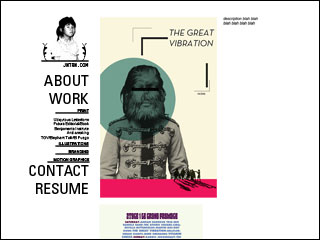
Another Helpful section was From Idea to Implementation. This gives me a very good tip in terms of how I will go about desiging my portfolio. Before I start sketching anything, I really need to sit down and think about what my portfolio is trying to say about me as a designer. Instead of using every fancy HTML/Flash on my page, I should really think about how certain ones can help enhance and are relevant to my work. In a sense, it's like form follows function. This section also reminds us that when we're designing our portfolio, we should try to leave a lot of breathing space to save us the headaches when we start diving into coding.
In relation to this thought, Epicenter from Chapter 9 also advises us to design our core page first and then work our way out. In this instance, I should be desiging my actual portfolio page first and then figure out how the rest of my page will work. In the end, the whole point of a portfolio is the work shown, not the medium in which it is containted in. Not to say that that too isn't important, because presentation is also very important. There should be a good balance and the work itself should be the focus of the site, not the structure.