September 9, 2010 previous next

SI SCOTT STUDIO
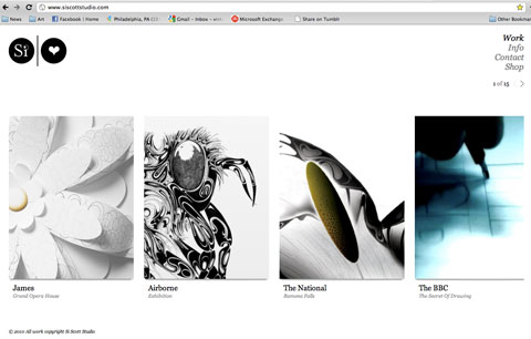
Si Scott Studio main page Scott Studio is one of my favorite portfolio websites for many reasons. Besides the fact that his work is absolutely breathtaking, the way he presents his work is very appropriate and cohesive with his kind of work. Scott has a very obvious style which deals with a great deal of intricate details. Because of this, he uses thumbnails as links to each of his pieces. Instead of having the whole piece being thumbnailed, the thumbnail is only a small portion of the work, which gives the effect of a zoom-in.

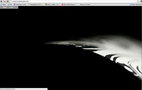
Once the thumbnail has been clicked, the whole screen is filled with the work rather than being directed to another page. This is another effective way Scott displays his work. Because the viewer's monitor is filled with the work, the viewer concentrates soley on his work and the details on that. Another method Scott zones in on his work is his mouse-over effect. When thumbnail is moused-over, all the other thumbnails are greyed out while the focused link is still black, making it stand out. The way Scott chooses to display his work online forces the audience to really focus on his work, and his work only.

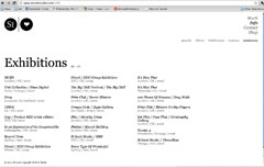
One thing that bothers me a little bit is the way the links to multiple pages are positioned on the site. The only instance is on the Exhibitions page. All of the navigation is done on the top right side of the page- except for the Exhibition links. Because of this, I almost didn't notice them. One way to resolve this is to simply place those numbered links underneathe the 2nd subcatergory links.

All in all, Scott's portfolio is beautiful. There are clear evidences of careful considerations of how he wants his work to be displayed. In addition to that, the photograph of his work is art itself! In certain pieces, he has close zoom-ins of his prints that look abstract but yet, elegant. There is a very stong connection between his actually work and his portfolio, very cohesive.
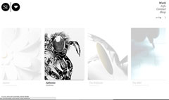
Mouse-over affect Multi-page navigation
View work page

IN CLASS EXERCISES:

one two
three four
five six
WE ARE LEARNING CSS TODAY!!!
specifically internal, which would be in the head tag. There are a few ways to target an element in html. One way would be to be first, set an attribute to that html tag. which would be to add an id element in the html tag itself.

the way we target this particular paragraph in the css, we use the #element name and then the type of html before the sharp symbol.

difference between class and id. Class can be applied to multiple things while IDs are applied to one thing. Basically an ID cannot be repeated while class can be.
There are different types of units that can be used in html but pixels would be the best because its reliable from browser to browser.
Hex values are made out of Red, Green, Blue. 6 numbers/letters each. first 2 is red, 2nd pair is blue, etc. Numbers from 0-9, A-F.

Difference between padding and margin is that if you have a color or background on the border/content, then its noticable whereas if you didn't, then theres not much of a difference. padding is the space between the content and border. i.e, this paragraph has no padding hence it being jammed up to the border.